Thursday, August 28, 2014

Mixed Media Marks All Pencil Self Portrait


The beginnings of a 8"x8" cradled wooden panel, mixed media piece, inspired by Jeanne Oliver's Creatively Made class. This was supposed to be a self portrait using a black Stablio marks all pencil, however, mine barely went that way. I printed out a black/white picture of myself, enlarged, and transferred it to the collaged papers on the canvas.


The transfer and a few more pieces added to collage...


Titan buff acrylic paint added...


Some stenciling, stamping, pan pastel, text strip, pencil touch ups, etc...


A touch of color to my face, gold leaf earrings, more touch up with the pencil and a Pitt pen, stenciled and written text, an edging, and I called it done. It's actually more colorful than the picture.

One day I hope to visit Paris, as soon as they build a bridge across the ocean! lol The text strip says, "I wondered how I would paint our times", and I tore it out of the book, White Oleander. I didn't make a picture of the sides, but I also collaged strips of sheet music and the book text paper around them, brushed titan buff acrylic over, and when that was dry, I stamped a feather around all of them in black. There is also some color rubbed on between the feather and the paint.

This was my first experience with a cradled wooden panel. It's great! Glad I ordered three of them!

Anyway, this is my version of the class, and I like it, even if it's not exactly a pencil portrait! Fun! :)

Monday, August 25, 2014

Vintage Hardware Art

Another Creatively Made inspired piece on a 6"x6" gallery canvas, mixed media. I didn't have the hardware to use on this project, as the name implies, so I just did it my way...


Mostly newspaper with a few other papers glued on the canvas and around the sides. The cat is a sticker that my cousin's daughter used on a thank you card that she sent me. I thought he'd look cute on here!


Found a magazine image that I really liked and sketched her on with a Stabilo marks all pencil. Trust me, she looks NOTHING like the image, but I like her.


Brushed on some titan buff acrylic, edged it in Q nickel azo gold (one of my new favorite colors), added a little color to the face, some touch ups with the pencil and a white gel pen, and the word CLASS from the classified section of the newspaper. I wrote the word Practice with a Pitt brush pen, but hate it, and I'm trying to let the background images show through some, like they're supposed to, and which I hardly ever do.


The sides with writing and too thin red wire wrapped around them, because it was handy...


Tried toning down the text some, hated it, and still hate the practice word... The whole thing is boring to me...


Aha! It needed some Q nickel azo gold added to the background, plus it covered up the p word! Better!


A few more touch ups and some writing with a white paint pen, and it now says "Always try to live with Class". It's actually a little darker than this. I like her!

I'm going to have to find a place for all these little pieces. They're stacking up on me! And they are all my children...:)

Saturday, August 23, 2014

First Plaster Attempts-Altered Sketch Book Cover

Before I learned that the plaster of paris strips won't stick directly to canvas, and while I was working on the plaster heart canvas in a previous post, I wet two strips and applied them to the front of the sketch book that I am using for the Studying Under the Masters classes (link on sidebar). The front had a slick finish, but I had applied some sticker paper and acrylic paint with the name of the class on it previously to the plaster, so I'm hoping it doesn't pop off like the plaster heart did. So far, so good!


I let the strips dry, using gesso on the space down the sides that the strips didn't cover...


Once the plaster was dry, I dry brushed some violet and yellow acrylic paint over it, picking up the texture, and let it dry...


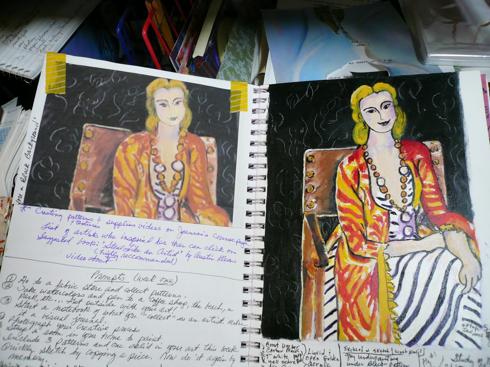
I printed off copies of two of the paintings I have done for the classes (Matisse and O' Keefe) and the title of the class on printer paper and, after I cut her out, did a gel transfer of the Matisse woman to the plaster. When that was done and dry, I cut out the calla lily and the words and collaged them on, also with gel medium. I learned that if the plaster gets wet, as with the gel transfer, it will come up during the rubbing process if I'm not careful.


I added a few touches of a gold leafing pen, two tiny real buttons, a little turquoise pan pastel rubbed on, and some touch ups to her dress with a white paint pen, and called it done. I like it!


Here are a few of the pages inside with my studies of the Masters' paintings, notes I took during the class, sketches, references, etc.- Matisse


Gaudi, an architect...


Gaudi Mosaic...


Cezanne watercolors...


Cezanne landscape...


Botticelli Madonna and Child sketch, ready to start painting...

These are only a few of the pages and the first part of the course. I left blank pages for each of the nine artists that we studied to do more studies and notes, so this book, and this course, is still very much a work in progress. Thankful the course is up for two years! Still lots to learn and practice!

Jeanne Oliver also has a new Studying With The Masters course available for the Fall. It will have six Masters to study with six new teachers and will concentrate on portraits and self portraits. I am already signed up! Go to www.jeanneoliver.ning.com for details!

I am certainly not one of the best artists out here, but I do love to try, and am so thankful to all the wonderful teachers out there willing to share their knowledge!

Tuesday, August 12, 2014

Contrary Angel Painting-"HOPE"


Okay, almost two years ago one of the classes in the 21 Secrets classes with Connie Hozvicka suggested, as a prompt, to paint larger than I was accustomed to painting. I had had the image of a red haired angel in my head for a long time, so I decided this would be a good time to try her. Connie is about painting freely and intuitively, which I love. So I cut off a length of canvas, clamped it to a big piece of cardboard, set it on my easel, and got started.

It's been a while, but I think the size is something like 21"x 42", give or take a couple of inches. I wanted it to be like a headboard for our king sized bed, so I didn't stretch it.


I have so many pictures  of her since December 2012 that I'm only sharing a few of them, but she went through MANY transformations before we arrived at a conclusion. I think this is the first one. I covered the canvas in thick white gesso, took the brush handle, and wrote large inspirational words and cookie cutter stencils/stamps on the canvas for added texture. I sketched her off from my imagination and started laying on layers of paint and marks intuitively. I know, not looking too good...


Another version with more paint layering; not liking the wings!


A layer of pink half circles over the background, including the halo, and some shaping going on. I tried umber on the wings, hated it! Some texturing and color on the dress, collar, and hair...


I tried black wings and putting the halo back once. Didn't work! I would get so frustrated that I started calling her "Contrary Angel" and would go for long periods of time without working on her, but she was always standing there glaring at me so that I couldn't discard her, and I would give it one more try.


Looking worse after I tried a sponge technique with titan buff acrylic on the black wings. Yuck!


At some point it came to me to add still more layers of paint to the background in grays and indigo blue. I also added some drips and dribbles and completely did away with the crown and most of the wings, because I could never get the wing feathers to look right. It's a wonder the paint didn't start sliding off in the floor at this point. I lost track of how many layers are actually on it.

When the new paint layers dried, the image of the bird and tulip emerged and the idea for the heart shaped wings presented itself. She stayed like this for a while, and I spent lots of time with her, trying to figure out how to finish her.

Spring of this year I took a course from Jeanne Oliver (Studying With the Masters) in which one of the Masters we studied was Botticelli. I didn't do anything else to the background, because I like the rainy look of it, but I added the star with a cookie cutter, filled it in with gold leafing pen, added a vintage green/gold earring, and painted her a pearl head piece.


I also gave her dress some polka dots with a found stamp and a hand cut copper heart on her lace collar with a metal finding that says "Hope". A few more layers of paint and texture on Hope, the bird, and the flower, plus some real string in the birds mouth and some printed off, cut out text, and we called her done. We're happy with her! And she's happy where she is...


Hanging over our bed, and the walls are not this pink. They are actually a soft coral. I attached her to the wall with copper tacks, which are not showing up, and I will eventually add a border of some kind, but this is how she is for now.


It's been a long journey for the both of us, and there were many times I wanted to rip her up and throw her away, but I was determined not to give up, and I'm so glad I didn't. We spent countless hours together, both working and in contemplation. I know I'm not a great painter, and she's not perfect, but neither am I, but we've learned a lot and grown a lot along the way, and we're both happy to be where we are, together.

And I love my "child" keeping watch over me while I sleep!

It's been an adventure!

Monday, August 11, 2014

What's On My Table This Weekend

I have some finished work, but don't have the posts written for them, so I thought I'd share some works in progress I have going this weekend. I decided to take a small break from classes and mixed media and do a little intuitive painting with acrylics on canvas, board, and paper.


X and O (or Kiss and Hug) is a thick layer of about 4 colors and white gesso smooshed around with a brush on a 6"x12" gallery canvas, then a plastic fork for emphasis...


On the right is about 3 colors plus white gesso smooshed around with a brush on an 8"x10" mixed media board, which I layed a sheet of mixed media paper on and rubbed to make a monoprint (on the left). I can see a dog  head, possibly wearing glasses, emerging in the right one and if I flip the monoprint I can see a man wearing a bow tie!


This 9"x12" gallery canvas also has a few colors plus white gesso smooshed around on it with a brush, then a monoprint pulled on mixed media paper (below), which flattened the paint some. I also dribbled water thinned white gesso down the page and left to dry...


Same painting flipped over: All sorts of images emerging from both views! Exciting stuff!


The monoprint I pulled from the painting just above it, on mixed media paper. When it dried I dribbled some black india ink on it, tilted it in different directions, and let it dry. It resembles a tree when I turn the paper vertically. At least, that's what I see!

I love doing these paintings and drawings intuitively and watching images emerge. It helps me to be freer with my painting, and not as fearful.

For now, I'm waiting for these pieces to tell me how they want to be finished! I'll post when they tell me! :)

Tuesday, August 5, 2014

First Plaster of Paris Adventure-Canvas

So I've been seeing all this wonderful work online using plaster of paris and thought I'd give it a try the other day! Didn't watch any videos, or classes, or read any directions, or anything.

I happened to have some plaster of paris strips bought for some other project and a 6"x6" gallery canvas with a background already painted on it in acrylics, so I got a bowl of water and sat down to experiment.

I cut off a length of the plaster strip, wet it, formed it into a ragged little heart, placed it on the water misted canvas, and left it to dry.


Didn't realize that the plaster won't stick to the canvas directly. It came right off...


Maybe it would stick to another piece of plaster strip! So I wet another length and smoothed it down on the canvas, stuck (I thought) the heart to it, and left it to dry...I wasn't thinking! If the heart wouldn't stay, neither would the strip. Duh!


It appeared to be holding the next morning...until I pressed on it lightly with my finger from the back. The whole thing, strip and heart, popped right off in one piece. Not to be outdone, I glued it back down with jewelry glue, and now that I think about it, that might not have been such a good idea either, since it wasn't water-based and everything else is. When it was dry, I painted a red watercolor over the plaster for some reason. I know not why!


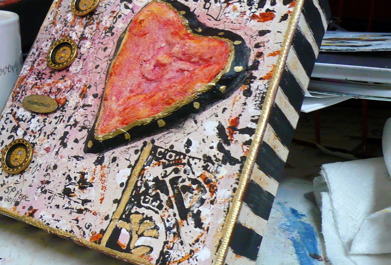
The red was really bothering me with the background, so I painted the whole thing acrylic titan buff, then dipped an empty washi tape cardboard spool in Quin Nickel Azo Gold (one of my new favorite colors) acrylic, made circles, and brushed some on the heart with my finger.


I sprayed the heart with Paprika Adirondack spray wash and when that was dry I brushed in some glass gel medium to add a little sparkle and a mottled effect. The cracks and crevices were left intentionally. I'm pretty sure my heart looks like this by now.

A layer of white gesso bubble wrap dots was added, then a couple of different stamps with black acrylic paint were layered over that,


 plus black was brushed around the heart and around the sides. I like the messy look!


After much pondering and looking through elements, I decided that the 3 metal buttons and the metal oval, which says "Memories", would work. The buttons already had the black on them, and I added a couple more black acrylic accents with a piece of corrugated cardboard, plus a few accents with a gold leafing pen, let it all dry, then sprayed with a matte sealer, and called it done!

Not the best job, but I like it, and I learned what "not to do" with the plaster.

 Unfortunately, I put two strips of plaster on the front of one of my journals while the heart was drying at the beginning. So far it's still holding, but if it ever gets a twist, it may all pop off. In that case I'll just put it in a frame and do another journal cover, I guess! lol

The journey and the learning is the fun part! Don't be afraid to make mistakes (it took me years to get over this fear)! That's how we learn! Have fun!

Thank you so much for your visit! <3


Sunday, August 3, 2014

Do-Overs

A couple of mixed media paintings I wasn't happy with and did some more work on this week. I like them both much better! Still not sure I'm done with them though!


Then...

Now! This one is on a mixed media board with stamping, stenciling, spattering, etc. It's mostly acrylics and a Pitt brush pen. I was practicing lettering. I need more practice!


Then...


Now! This one is also on a mixed media board, and is a mixed media piece with many layers of acrylic paints, stenciling, photos, marks all pencil and all sorts of other stuff. I didn't like the first one at all, so I scrubbed white gesso all over the painting, and added white paint and marks all pencil. I like it much better, and  her hair isn't really that bright yellow that the picture shows. It was inspired by a class I took last year from Heather Murray's Mixed Media Memory Portraits class at the Trodden Path group (link on sidebar).

The little girl is a photo of me when I was ten years old, and I was wearing a bathing suit, about 1959. The man is a photo of one of my ancestors that my uncle gave me. I love his pose with the fiddle! The dog is my beloved little fur-baby, Kibbles, that was my constant companion for sixteen years during the 1980s-90s, and she is still missed terribly. She was actually very small, but the size I used in this painting shows how important she was to me.

I have been at a bit of a stand still this week. No energy and feeling somewhat overwhelmed. I have several drafts for posts started to share when I can get focused and the energy to finish them. I'm also on the 4th, and last, week of Jeanne Oliver's class, Creatively Made, and have several paintings to share from that class, which I am loving and learning so much from.

Happy painting! :)