Sunday, June 29, 2014

Nellie, Lue, and The Little Back Dress-Mixed Media Memory Portrait and Story

Okay, so I had this vision of a painting with two of my favorite people in my whole life, my paternal grandmother, Lue, and her daughter, Nellie. I collaged various papers on a 6" x 12" gallery canvas for texture to start it off. By the way, the painting was inspired by a class I took from Heather Murray at the Trodden Path (link on sidebar) called Mixed Media Memory Portraits. And when I say "inspired by" it means I'm not necessarily following her process. Her paintings are awesome! :D

The story of the little black dress is at the end!


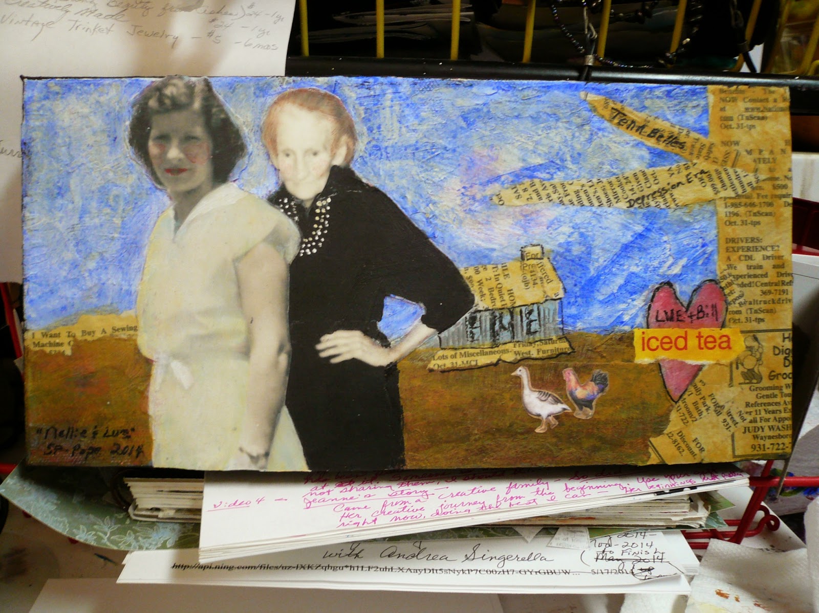
I found these separate pictures of Nellie and Granny Lue, printed them off in B/W, cut them out, played around with composition, and glued them on to the canvas...


THEN I painted the background with acrylics, which I SHOULD have done before gluing down the figures. It would have been much easier! :/ I left the magnolia and the original handmade heart showing. There are actually 3-4 layers of paint at this point, but the nuances aren't showing up much...


Another layer or two of paint, Lue's beads, color to the magnolia, and the idea of a tree/leaves added...It's about at this point that I realize that Nellie and Lue are from two different seasons, times of day, and eras! Nellie's face is in shadow, Lue's is in the sun! Nellie is in the summer of the early 1950s and she's wearing white cotton, and Lue's is in the fall of the early 1970s, and she's wearing black light weight wool. Lue would have been MUCH younger if they had been in the same picture, but I decide it's all ok.

 Mothers and daughters are the same, but opposite in many ways. I could have painted over them and changed it, but I really didn't want to, so I just went with it...


Another layer of paint, covers up the magnolia and leaves, the tree is painted in, and the old house is sketched in...Not liking it...Ponder on it for a few days...


Another layer, or two, of acrylic paint on the background, Lue's pearls are painted out and back in, A pale yellow glaze goes over Nellie's dress, and a little color on their cheeks and hair, and on Nellie's lips. Lue had red hair when she was young, but barely a hint of it when she was older (this picture of her was made on her 80th birthday). I get the idea to use an old torn newspaper to collage the tree, house roof/porch, and a little conversation on the left, and there is a reason for this (see below). Lue + Bill (grandpa) is written in the heart, which I could not bear to cover up for some reason. Something is still missing...


After a couple more days of pondering, it dawns on me that it needs a chicken! And a goose! Now I can live with it, and it has sentimental and symbolic meaning for me!

The story...

The first night I ever spent away from mama, as a baby, was with Aunt Nellie. So was the second night a few days later. I adored her when I was little, and she treated me like one of her own. Her children were like my siblings. Still are! She was always giving me stuff to play with, and she sewed clothes for my tiny tears doll, which I still have. Once, when she came home from working on a tow boat, she brought me a doll. She and Uncle Edgar were always very good to me.

And I loved her laugh. It was infectious!

I don't know if I had started to school yet, but when I was pretty young she moved to Lousiana, so we didn't get to see her often after that, maybe once a year, or so. I always looked forward to seeing her when she came home to visit.

When I was ten years old mama went to work in the local factory, and during school days I stayed with a neighbor before and after school, but during no-school days, and in the summer, I stayed with Granny (Lue). I have great memories from those times. She taught me so much and let me get away with so much! lol

The black dress came in to play when Aunt Nellie sent it to Granny Lue for either her birthday in October, or Christmas. It was a simple black dress with 3/4 raglan sleeves, a belt, a three-strand faux pearl necklace, and it was made of light weight wool.

I was fascinated with it from the time I saw it. It was beautiful and elegant! This was when I was maybe eleven or twelve in the late fifties/early sixties. I asked her one day if I could try it on. She told me I could, but to be very careful. It was expensive and it was from Nellie.

It fit me perfectly! I felt so grown up in it, as I twirled around and posed in front of the long mirror in the old chifferobe.

From then on, I was often found modeling that dress when there was nothing else to do. Modeling that grown-up dress and daydreaming, with a pony tail and sneakers for accessories. I still felt elegant!

Eventually, I outgrew modelling the dress, but I always loved it.

In 1967, the year I graduated high school, soon after my eighteenth birthday, Aunt Nellie was killed in a tragic accident that almost took the lives of her baby boy and her little granddaughter, as well. She was still a very young woman. It left a crack in my heart, as it does every time I lose someone I love dearly. Granny Lue wasn't able to make the trip to Louisiana, but she grieved heavily for her loss.

On Granny Lue's eightieth birthday, most of her children and grandchildren gathered at her home to celebrate, and she wore the black dress and pearls. I, and I'm sure Granny did too, felt Aunt Nellie's presence there, as she had her picture made in that dress.

I don't know what ever became of the black dress, but somehow I wound up with the faux pearls and still have them, along with a favorite memory of  times gone by. Granny Lue passed away a few years after I married in the seventies.

Both of them are always in my heart and very much missed. I won't ever forget the little black dress and how grown up and elegant I felt when I put it on, and I will forever be linked to Nellie and Lue and that black dress in my memories.

Footnote: Granny Lue was nineteen when she married my forty year old grandpa, and they had eleven children, six girls and five boys, which they raised to adulthood, much of it during the great depression. They lived in little more than a shack, represented in the painting, up in a holler when my dad was growing up.

The house Granny lived in much of the time I was growing up had old newspapers covering the walls and ceiling in the spare bedroom (she only had two). Mama would drop me off at Granny's on her way to work, and Granny would unlock the door to let me in, then we'd both crawl back into her big old fluffy feather bed and sleep until we got ready to get up. When my cousin Laura and I spent the night we slept in the spare room bed, but before going to sleep, we'd read the newspaper ads on the ceiling above us and giggle until the wee hours, when sleep overtook us. Thus the newspaper tree and roof in the painting!

Two of the strong Southern women that influenced me greatly as I grew up. And they still do!

Wednesday, June 25, 2014

Art Journal Pages and New Tape

I came across this Moleskine art journal that I had started, a while back, the other day. I may have shared some of these pages already, but others are new, or I added some stuff to them. They don't look this dull in reality. I'm not good at photographing my work! :/


Love these pages! I used real lace for a stencil, spray ink for the background, and writing in both directions. The color in the center leaked through from another page, but that's ok!


Love this spread too! I collaged various papers onto the pages, added acrylic paints, made cap lid stamped circles, and glued a stamp image from Somerset Studios into the corner. I'm hoping that's ok, since I won't be selling the book! It's ready for writing on!


More pages with collaged papers, spray inks, lace stencil, figure cut out of scrapbook paper, and lettering with an acrylic paint pen...


Playing with acrylic ink blobs on these pages! I can see various images peeking out already! Now ready to write on and/or add drawing/more paint to!


WIP-Various collaged papers to take further when something strikes my fancy!


I think this spread may be ready to fine tune and write on! Collaged papers, acrylic paints left over from another project, and a kimono cut from scrapbook paper...


WIP-India ink blob and torn napkin to do further work on...


Look what I found at Wal-Mart the other day! Scottie dog duck tape, and it's PINK! I love Scottie dogs! The black/white dotted roll is also Duck tape, and the other three are Duck fabric tape, some of which I've already put to use, and I'm sure all of them will be showing up on journal pages soon! FUN stuff!

Happy Creating! Do some of what makes you happy and feeds your soul every day! It makes you a better person! :)

Tuesday, June 24, 2014

"Alphabet Dress"-Mixed Media Painting

This mixed media painting was inspired by the class "loose and raw", which I took from Sue Pelletier last year. I started it as a gift for one of my best friend's new granddaughter, but I totally messed it up and wound up sitting on my shelf next to my other mistakes. Planning to do another one, leaving out the wrong turns I made on this one.


Collage/texture (denim, wallpaper, piece of canvas, paper) on a gallery canvas and a dress sketch based on a dress that my friend gave me for a Patty Playpal doll when her daughter was little and had outgrown it...


Under painting and more sketches added with a Stablio marks all pencil, black; the child's name is meant to go in the squares...


Tried to lighten the tone up some with more acrylic paint...


Added a thin piece of paper over the dress body and a piece of lace over the collar to add texture, more paint, white pen, buttons, paint pen...Now realize the dress takes up too much space and I can't change that. Put the name in the squares, hated the whole thing, painted the letters out...


Painted the squares this awful green and stenciled alphabet letters on, added more blue to the dress to keep it from looking too chalky...


Wound up painting the squares this purpely-maroon color, which brought the letters out more, and added a little of the color to the dress and around, along with the white paint pen, bringing it to the point that I can live with it, but it won't be a gift. It's supposed to look raw and gritty and loose, but I think I overdid it a little, and it's not bright and happy like something for a little girl should be...

Anyway, it was fun to work on, and I will be doing another one. In fact, I have two adorable little girls in mind...if I don't mess up again!

I'm still taking a break from the "Studying With the Masters" class, and took a vintage jewelry class (I may have told you already) and am now taking one of two classes from Jeanne Oliver, all on her site (link on sidebar). The class I'm working on is  "Creatively Made" and it's awesome! The next one is "The Journey of Letting Go". By the time I get these two finished, the new "Studying With the Masters", figures/portraits, will be up! Anxious to see what Masters we'll be studying in that one!

I have yet to actually make any jewelry, but I have the makings to get started!

I've made some journals for the first week in "Creatively Made", which I loved doing and will share in a few days. I have several projects going, housework is piling up, and the summer is flying by!

Contented and grateful!

Wednesday, June 11, 2014

Study of Henry Clive Pierriotte 1-Masters Class-Week 10


 Studying Henry Clive under Christy Tomlinson in the Studying With the Masters Class: This was supposed to be week 7, but something came up that week, so we took a break for this week and played catch up with the other artists. So this class was moved to last and became actually week 10, and the last class and artist. 

I love the illustration by Clive above, because I love the Pierette (?) clowns (not circus clowns though). Clive was known for his magazine cover illustrations, and this one looks like it was done in pastels. I, once again used acrylics in my mixed media journal. 

Like all the other masters, his work is deceptively simple looking!


I started with a loose sketch after I put a coat of clear gesso over the page, giving the paper a tooth to grab the paint. It also makes the acrylics not so slick and shiny looking.


I got it a little bit larger than it should have been, but it's practice, so I left off the magazine title in the background and painted an undertone of ochre and red, because I can see some orangy-red peeking through the other colors...


Mixed up some black and white to make gray and put in a layer, adding more white in places...


She's hideous here! Her face is out of proportion, and it shows up really bad. I straightened up her facial features and the side of her face and kept adding layers of paint and tinkering with it until...


I found a place that I though I'd better stop. I can live with her! Black and white objects, or faces are really difficult for me, so this one was definitely a challenge, but she was worth it to me.

I now have at least one study done from each of the nine masters we studied, so now I can go back and do some more of the prompts that the teachers gave us. I have learned quite a bit about myself through the process of this class, as well as from the Masters and the teachers, and I'm grateful. :)

Links on the sidebar for this course and places that I also share my art, my FB page, Creative Every Day, and Paint Party Friday.

I hope you have enjoyed my journey through these classes, and I look forward to sharing more from it as I complete it. I don't claim to be a pro, or even good, but I do love the process of learning and doing! :)

Monday, June 9, 2014

Study of Francoise de Felice Girl & Dog 1-Masters Class-Week 8


Studying Francoise de Felice under Kate Thompson in the Studying With the Masters class. Francoise is the only living master that we studied in this course, and her work is amazing. Above is one of her paintings that I chose to study. She uses a lot of glazing and veiling in her paintings, and some collage also. I couldn't match her colors, but I learned from her process, which is what counts.


I forgot to make a photo of just the sketch before I started, but I used gel medium to glue some napkin pieces with flowers on them to the background, then I used chinese  Sumi watercolors to add color. The girl was also basically nude, so I gave her a little covering.


Now using acrylics in thin layers over the watercolors...


Cringing as I look at this, but I added white mixed with gel medium, trying to give it a veiled mysterious look. I failed! Yuck! I briefly considered changing paintings, but decided it wasn't going to get the best of me...


More yuckiness and I glued another piece of napkin over her top. Hate the bathing suit...


which I turned in to a dress. Still hate it and want to throw it away, but can't let myself for some reason...


Basically re-painted the whole thing with acrylics to bring the color back. Added some stamping and some marks to the background...


Added some dribbles and some other marks...


and stopped on her! I apparently don't do light and delicate! Not an exact copy of Francoise's, but I love her process, once I kind of got the hang of it! I have to say, this was the hardest, most complicated artist that we studied for me to learn from, but she's an amazing artist. I'm glad I was introduced to her and have become a fan.


This is another of her paintings that I love, and am thinking of using it as inspiration to paint one of me and my two best friends in the prompt to paint an original painting using these techniques.

All of my paintings, so far, from this course are in my mixed medial art journal along with notes taken from the videos and teachers, but my originals will be on canvas or panels.

You can check out the Studying with the Masters class by following the link on my sidebar, and there's going to be a part two this fall, which will be portraits and self portraits!

Monday, June 2, 2014

Study of Botticelli Young Girl 1-Masters Class-Week 4


Studying with the Masters class-Botticelli with Jenny Wentworth---Botticelli's version of a head taken from a group painting, a study that I have been working on, or not, for several weeks. Every photo of it was different color wise, so I didn't try to match. I just studied his process and did what I could. Below are some of the ugly steps she went through before I found a stopping place.


Journal page painted with black gesso, sketch with a white marks all Stabilo pencil...


Under painting, and I put a layer of burnt umber paint over the black gesso to warm it up some...


First layers of paint over the under painting...


More layers...


And a few more before...


I found a stopping place. I considered using a crackle effect on the black background, but decided against it. Botticelli's paintings were very smooth, and he often used brushes with very few bristles in them. I didn't have the patience to do that, but I did use a very small liner brush. The tiny strokes don't show up great in the photo, but they're there! Not as delicate and pretty as Botticelli's, but I like her!

I know there are a lot of things I could still do to make it better, but I enjoyed the process, learned from him, and moved on to Francoise de Felice. Two more artists to go!